Note
Go to the end to download the full example code.
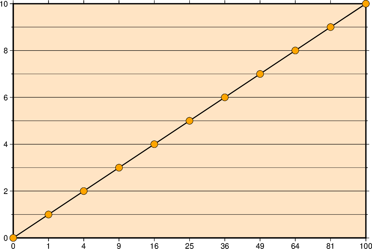
Cartesian power
Xwidth[ppvalue][/height[ppvalue]] or xx-scale[ppvalue][/y-scale[ppvalue]]
X or x: Sets the projection type.
width or x-scale: Sets the plot size.
height or y-scale: Sets the plot height [Optional].
ppvalue: Applies a power transformation with exponent pvalue to an axis. Append it after the corresponding size argument [Optional].
import numpy as np
import pygmt
from pygmt.params import Axis, Frame

# Create a list of y-values 0-10
yvalues = np.arange(0, 11)
# Create a list of x-values that are the square of the y-values
xvalues = yvalues**2

fig = pygmt.Figure()
fig.basemap(
    region=[0, 100, 0, 10],
    # Set the power transformation of the x-axis, with a power of 0.5
    projection="X15cp0.5/10c",
    # Set the figures frame as well as annotations and ticks
    # The "p" forces to show only square numbers as annotations of the x-axis
    frame=Frame(
        axes="WSne",
        fill="bisque",
        xaxis=Axis(annot="1p", tick=True, grid=True),
        yaxis=Axis(annot=2, tick=1, grid=True),
    ),
)

# Set the line thickness to "thick" (equals "1p", i.e. 1 point)
# Use as color "black" (default) and as style "solid" (default)
fig.plot(x=xvalues, y=yvalues, pen="thick,black,solid")

# Plot the data points on top of the line
# Use circles with 0.3 centimeters diameter, with an "orange" fill and a "black" outline
# Symbols are not clipped if they go off the figure
fig.plot(x=xvalues, y=yvalues, style="c0.3c", fill="orange", pen="black", no_clip=True)
fig.show()
Total running time of the script: (0 minutes 0.143 seconds)